Mobile
Mobile is not “pinch to zoom the desktop site”
Tap targets, readable type, and layouts that work on a 390px screen.
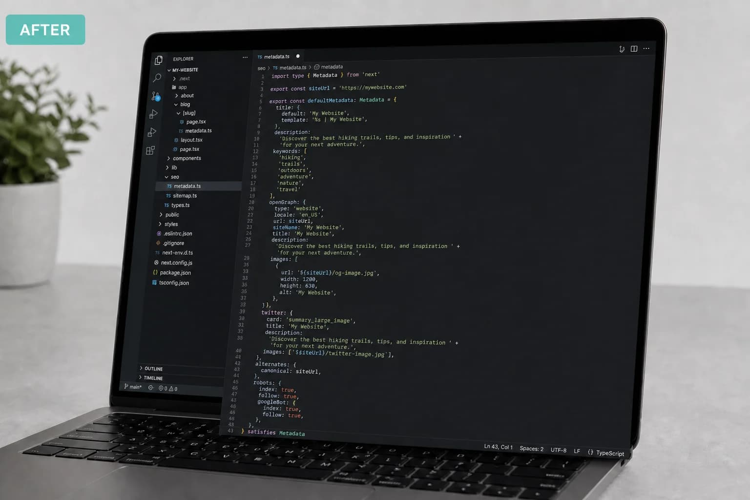
JMP is the jump into a modern stack. This topic is what that looks like in practice.
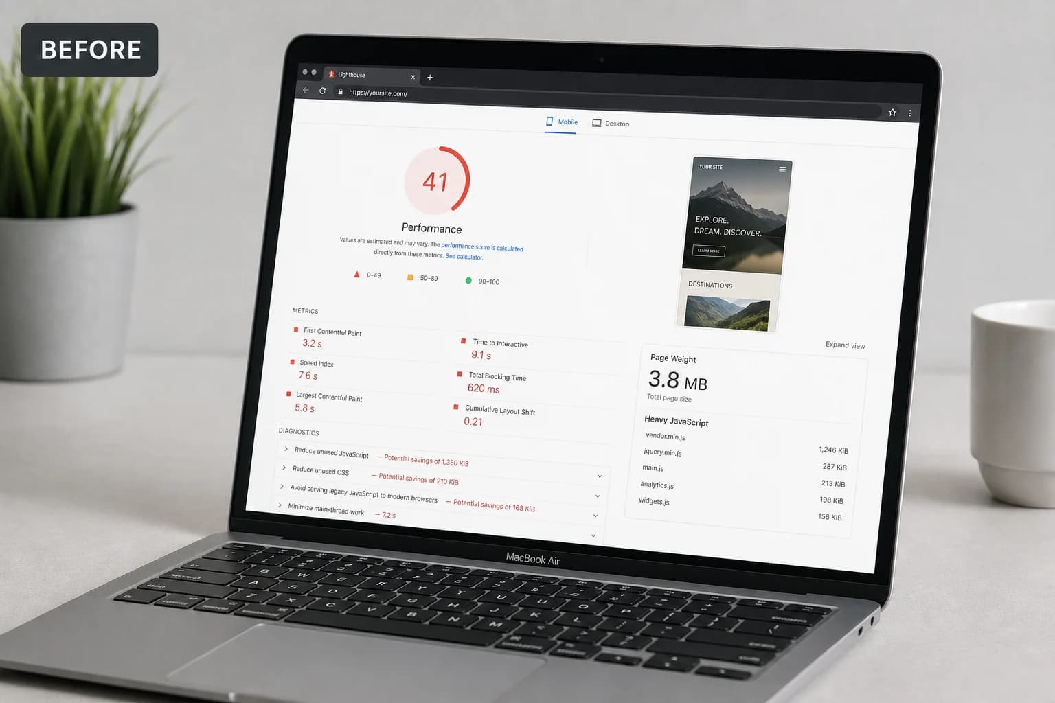
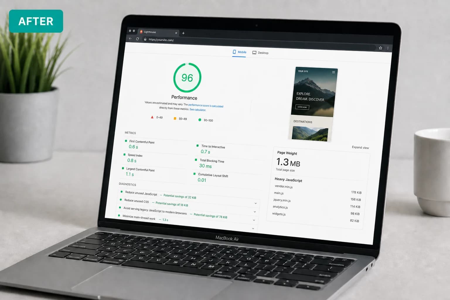
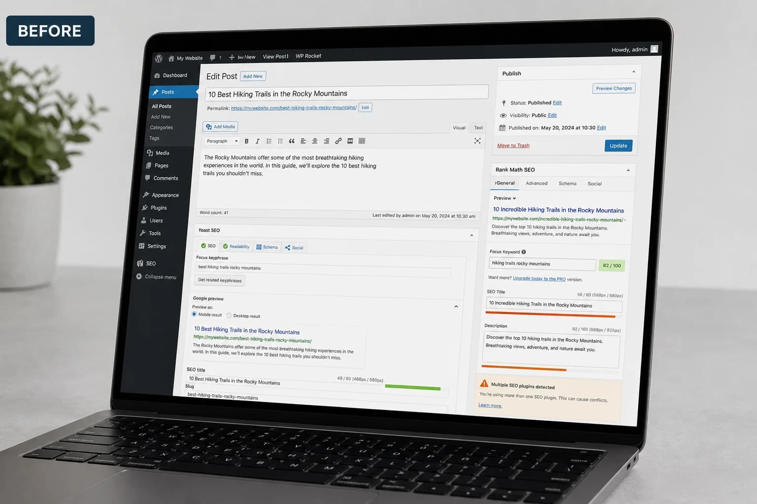
Half your traffic is on a phone. A theme that “has a mobile version” often still ships tiny links, cropped heroes, and forms that are painful to finish standing in a parking lot.
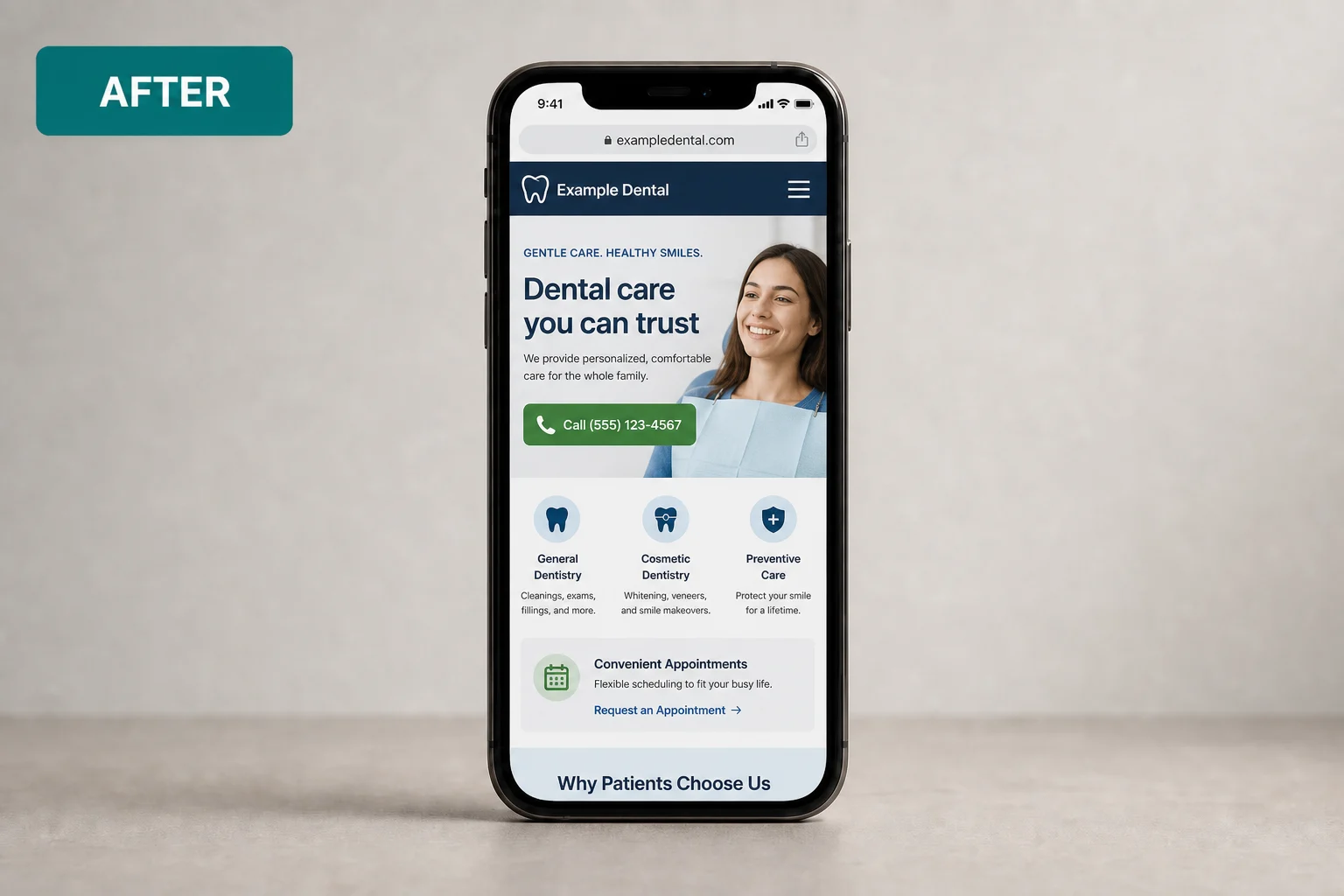
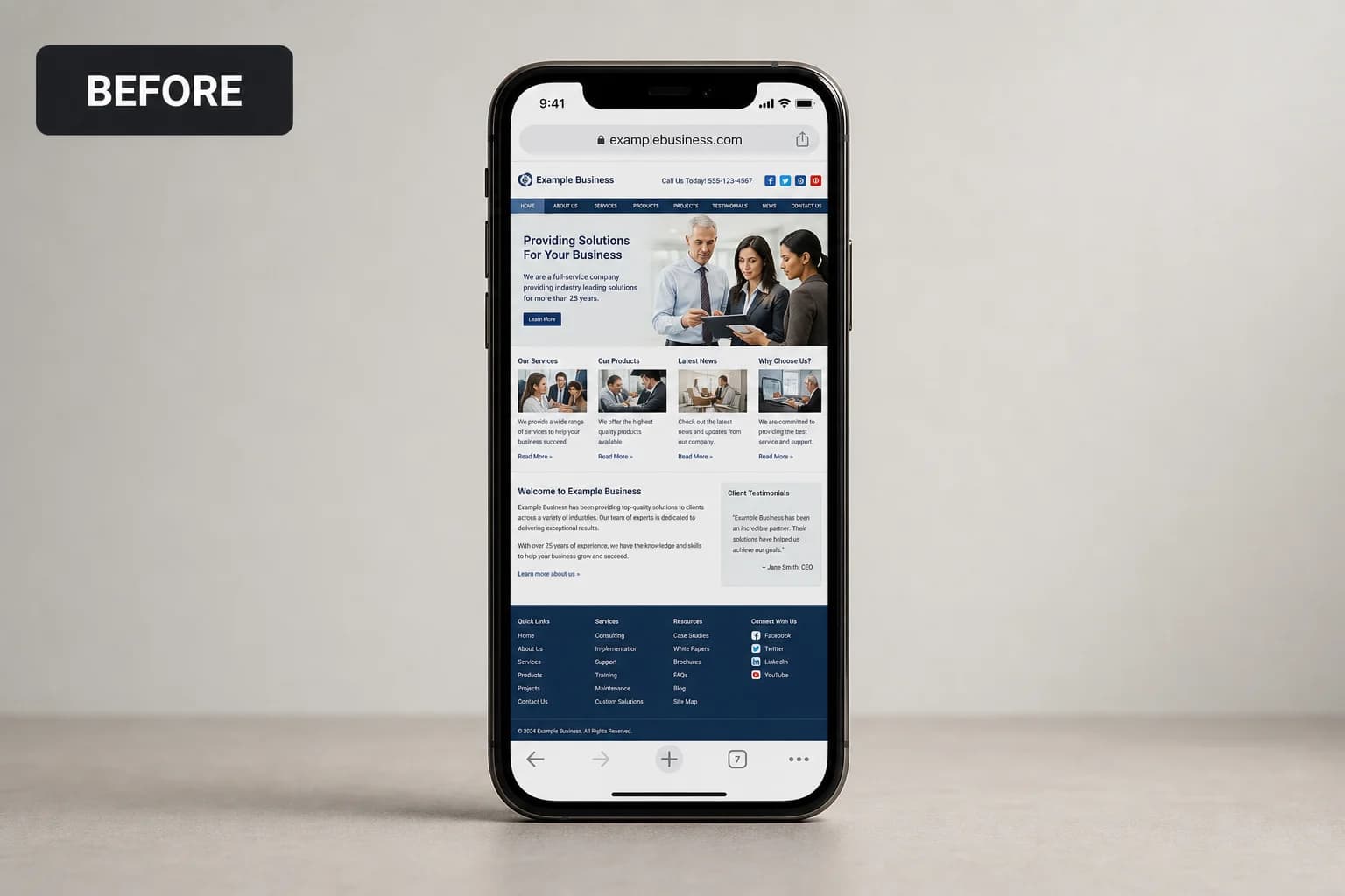
Drag the divider to compare typical setup with a JMP build.
At a glance
Typical setup → JMP build
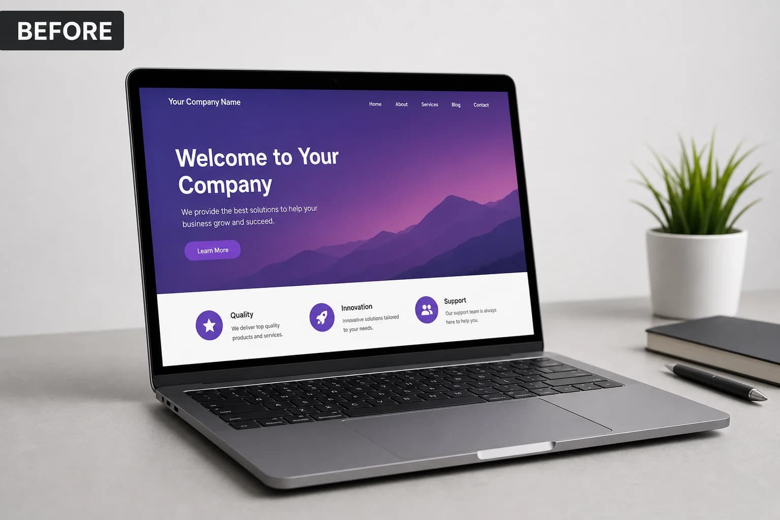
Typical
Hamburger menu that hides the phone number
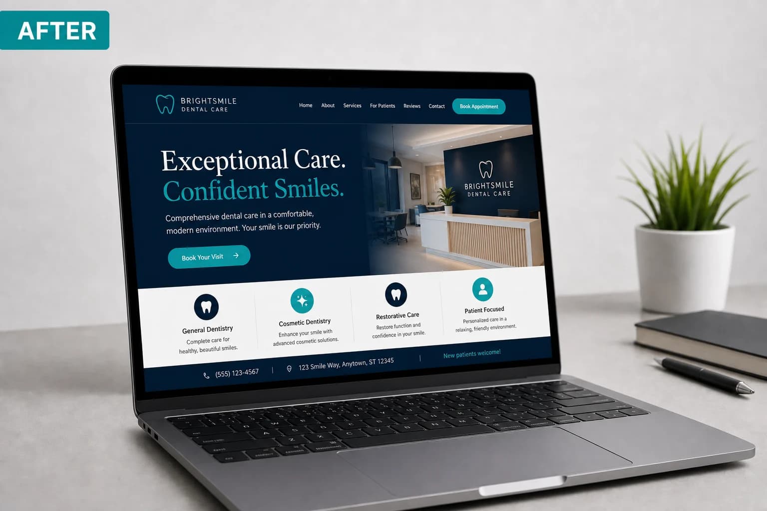
With JMP
CTA visible without hunting
Typical
Forms that zoom on focus
With JMP
Inputs sized for thumbs
Typical
Hero text over a busy photo
With JMP
Contrast checked on real devices
Try it on your phone
Experience your site like a visitor on cellular
Responsive previews in a theme editor are not enough. Real devices, throttled LTE, and Lighthouse mobile mode surface the pain your customers feel in a parking lot.
Load the site on your phone
Use cellular—not office Wi‑Fi. Can you tap call, find the form, and read the hero without zooming?
Run mobile Lighthouse
In PageSpeed Insights, compare Mobile vs. Desktop. A big gap usually means desktop-first scripts hurting phones.
Check tap targets and type
Buttons and links should be thumb-sized; form fields should not trigger zoom-on-focus on iOS.
Before launch we review priority pages on iOS and Android and list embeds that cannot be saved. Next: Search & indexing.
Working with JMP
Review on iOS and Android before launch
Priority pages listed (home, services, contact)
Fix list if an old embed cannot be saved